- Copyright ©2019
- All Rights Reserved.
Download PDF Specimen
Rooftop, a quick story
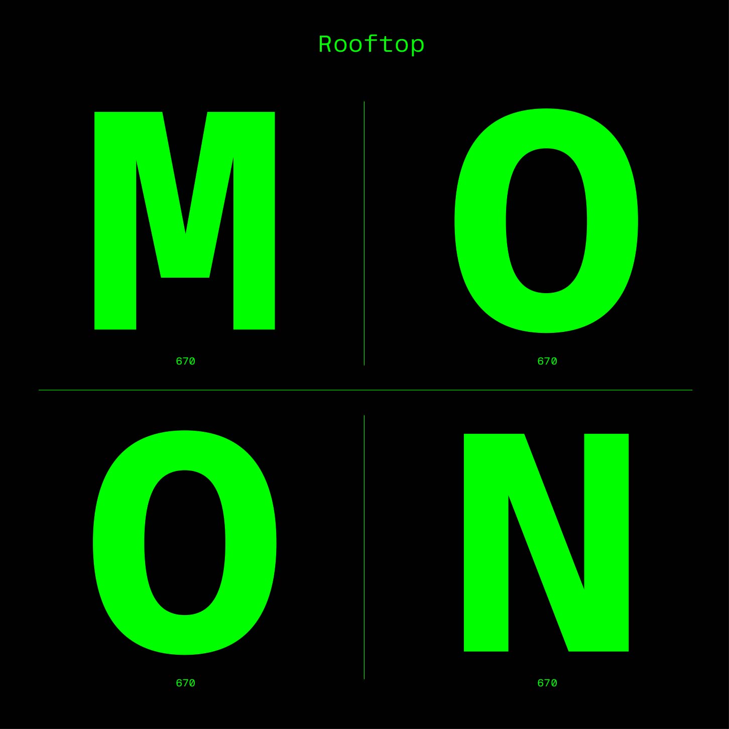
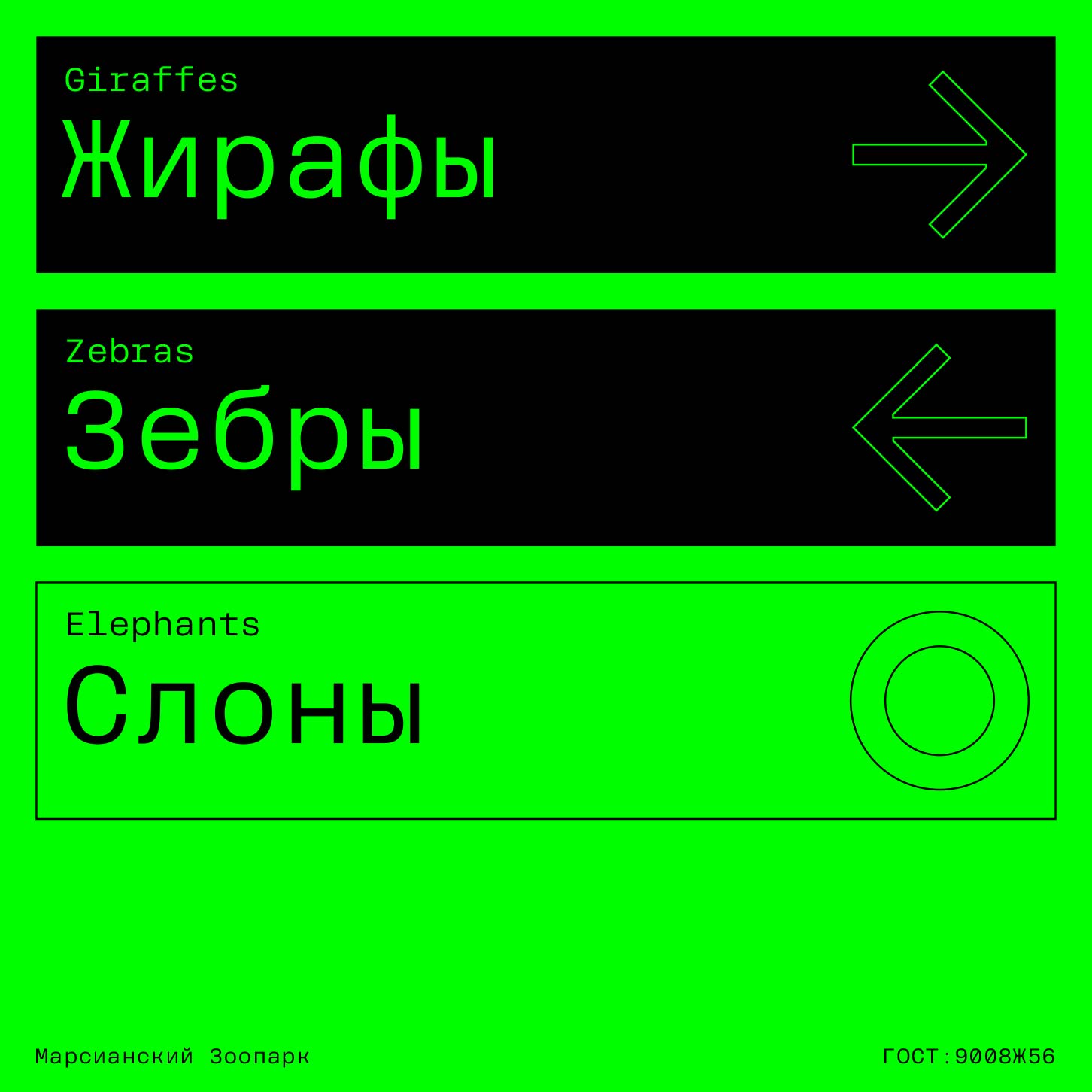
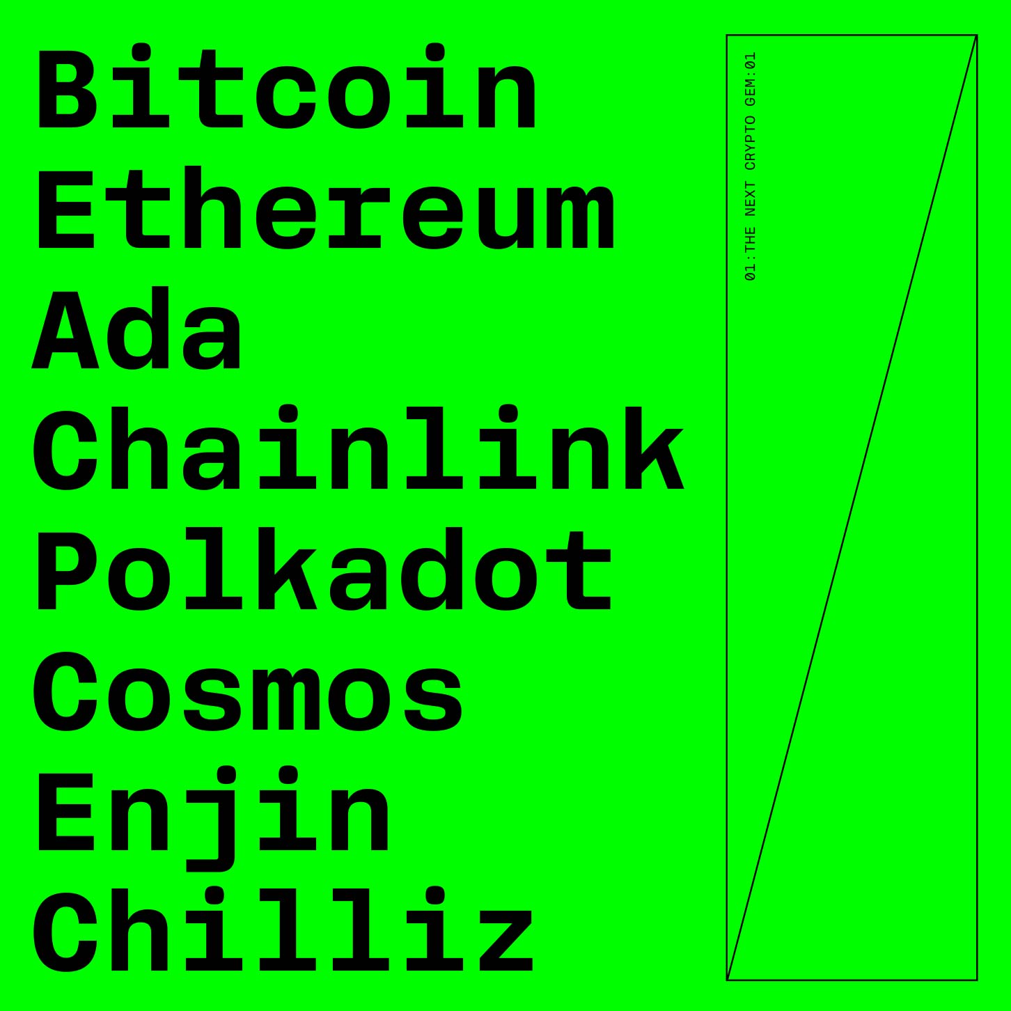
Largely inspired by the american grotesks of the early 20th century such as Lining Gothic of Barnhart Bros. and Spindler or Gothic No. 2 of Palmer & Ray, Rooftop carries humanist approach to grotesk typeface construction and adds a 21st century tech start up vibe to it. Slightly squarish curves — a somewhat forgotten approach in the last 10-15 years makes Rooftop feel somewhat sturdier and techier. This idea is complemented by the brutal approach taken to constructing letters like f,t,r,g,y. Designed with legibility in mind, Rooftop works well in all sizes and can be used in print or web.
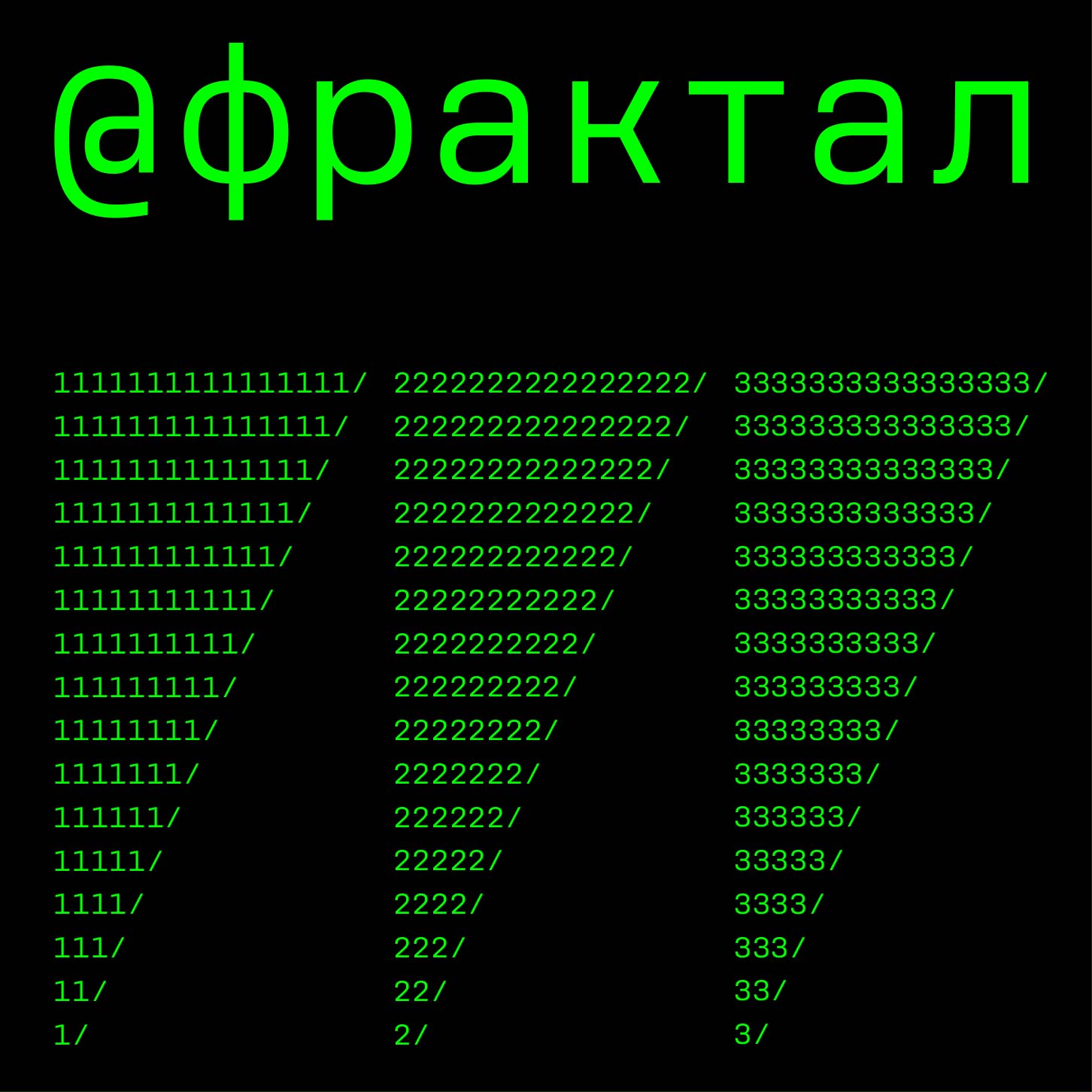
Scripts: Extended Latin, Cyrillic


