,

Cart (0)

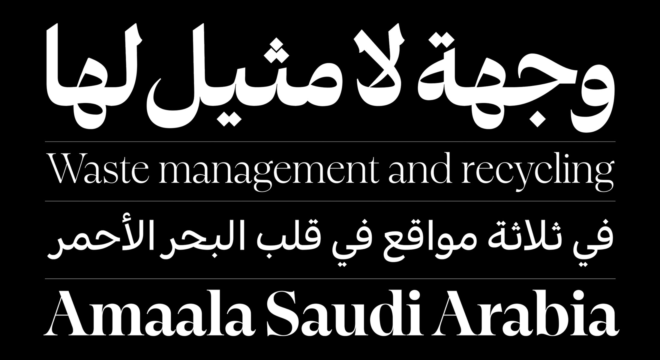
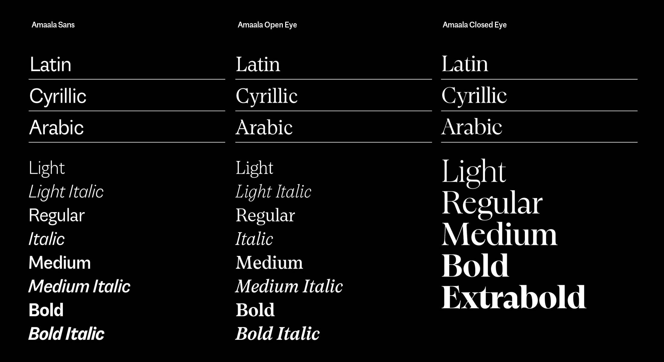
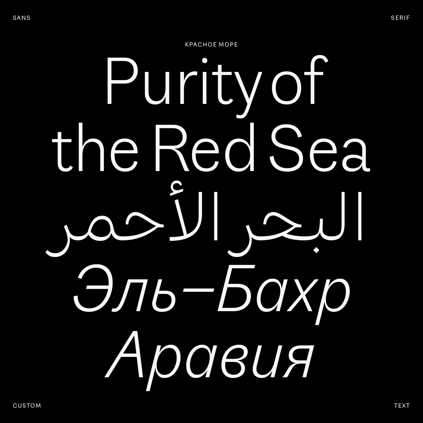
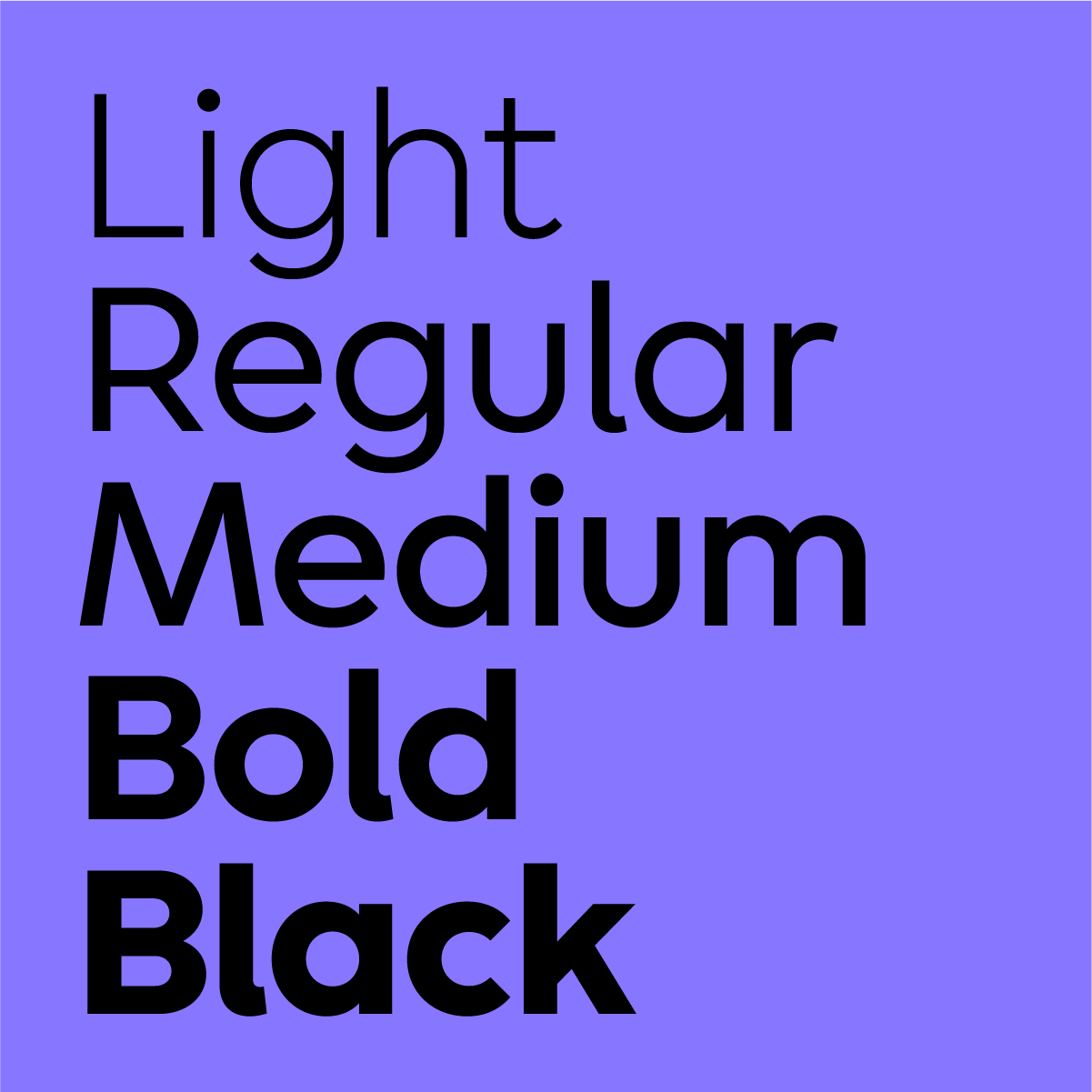
We really enjoy collaborating with designers and agencies to create unique typefaces
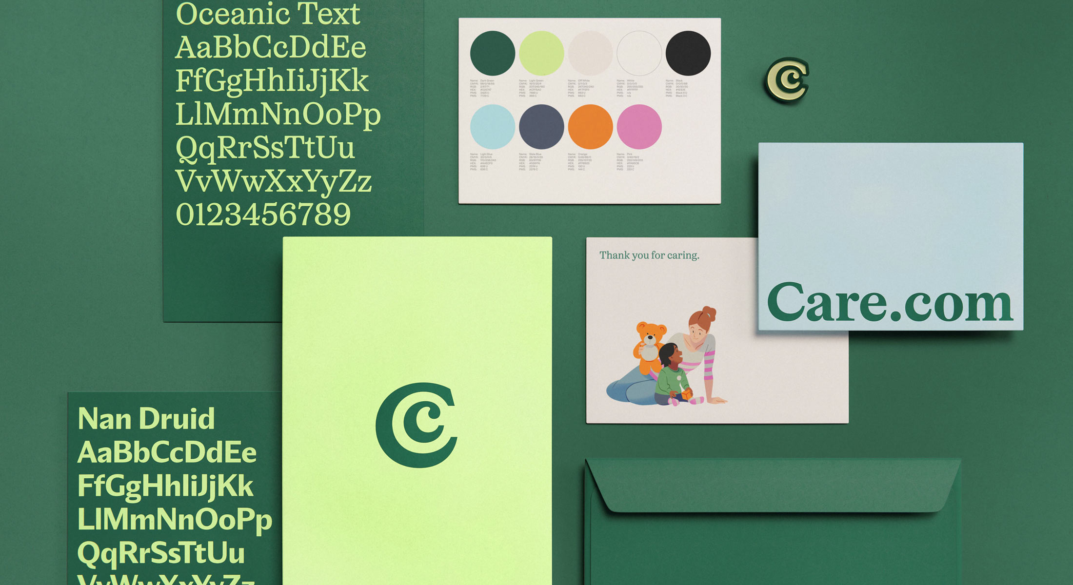
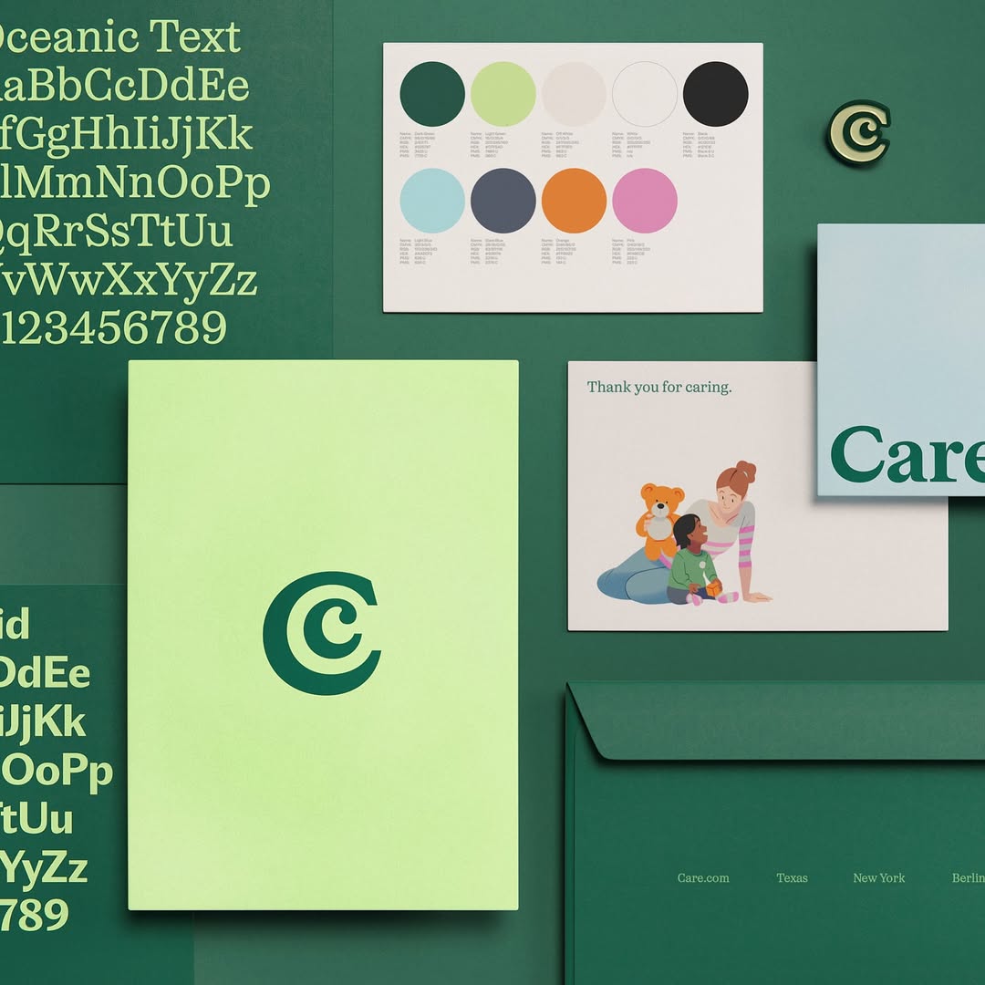
Amaala, Saudi Arabia

Amaala is the ultimate luxury resort in Saudi Arabia, located in a unique location on the coast of the Red Sea. As part of the global branding project, that reflects the cultural roots and the unique features of the destination, we were asked to create a global type system. We design a multi-script (Arabic, Latin & Cyrillic), Sans, Serif, Display and Text mega family that could be used in any situation from signage and installations to text setting in small sizes. Comissioned by Landor Paris.

Bouygues Telecom, France

Bouygues Telecom is one of the largest mobile and internet operators in France. As part of their rebranding project the company was looking for a new type system that would reflect their jovial personality and tech approach. Together with BETC we created 2 type families: Bouygues Speak and Bouygues Read. The Speak family that is used for titles, has a set of alternates for round letters such us 'o', 'd', 'b'...etc. The diagonal oval counters stem directly from Bouygues' logo. The Read family is destined for text setting. Its techy design well complements the friendly personality of Bouygues Speak.

Bright Park, Russia

Bright Park is the biggest car dealer in the Ural Region, Russia. The new display typeface we created plays a central role in rebranding, which takes a bold and risky approach for a somewhat 'traditional' business model. Bright colors and an innovative approach to a 'latinised' cyrillic all come together to create something truly unique.

A question?

Your message was sent