
- Copyright ©2019
- All Rights Reserved.


Download PDF Specimen
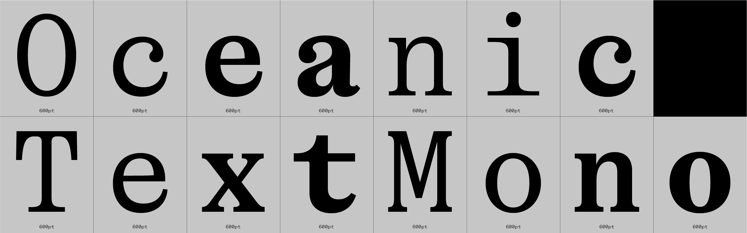
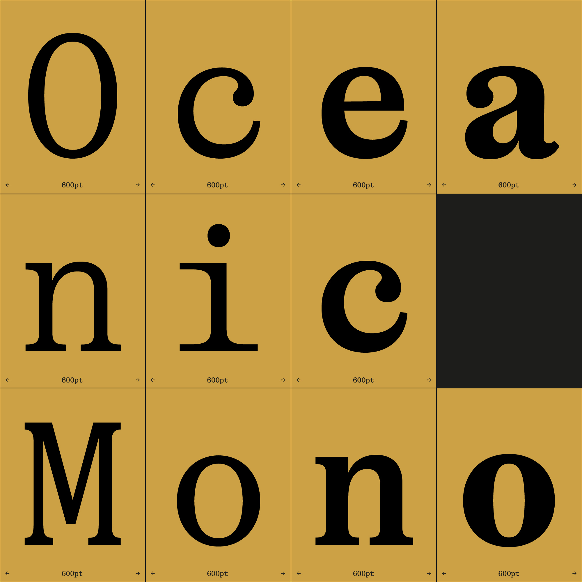
Oceanic Mono, a quick story
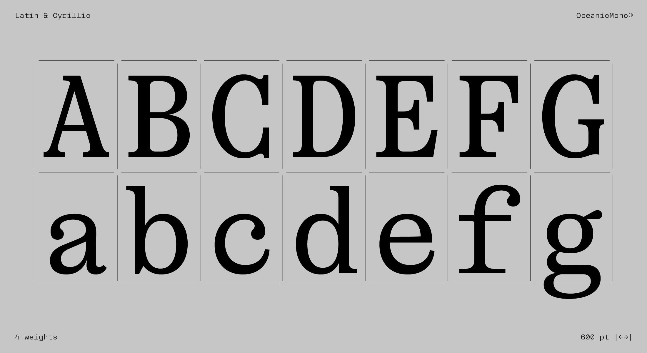
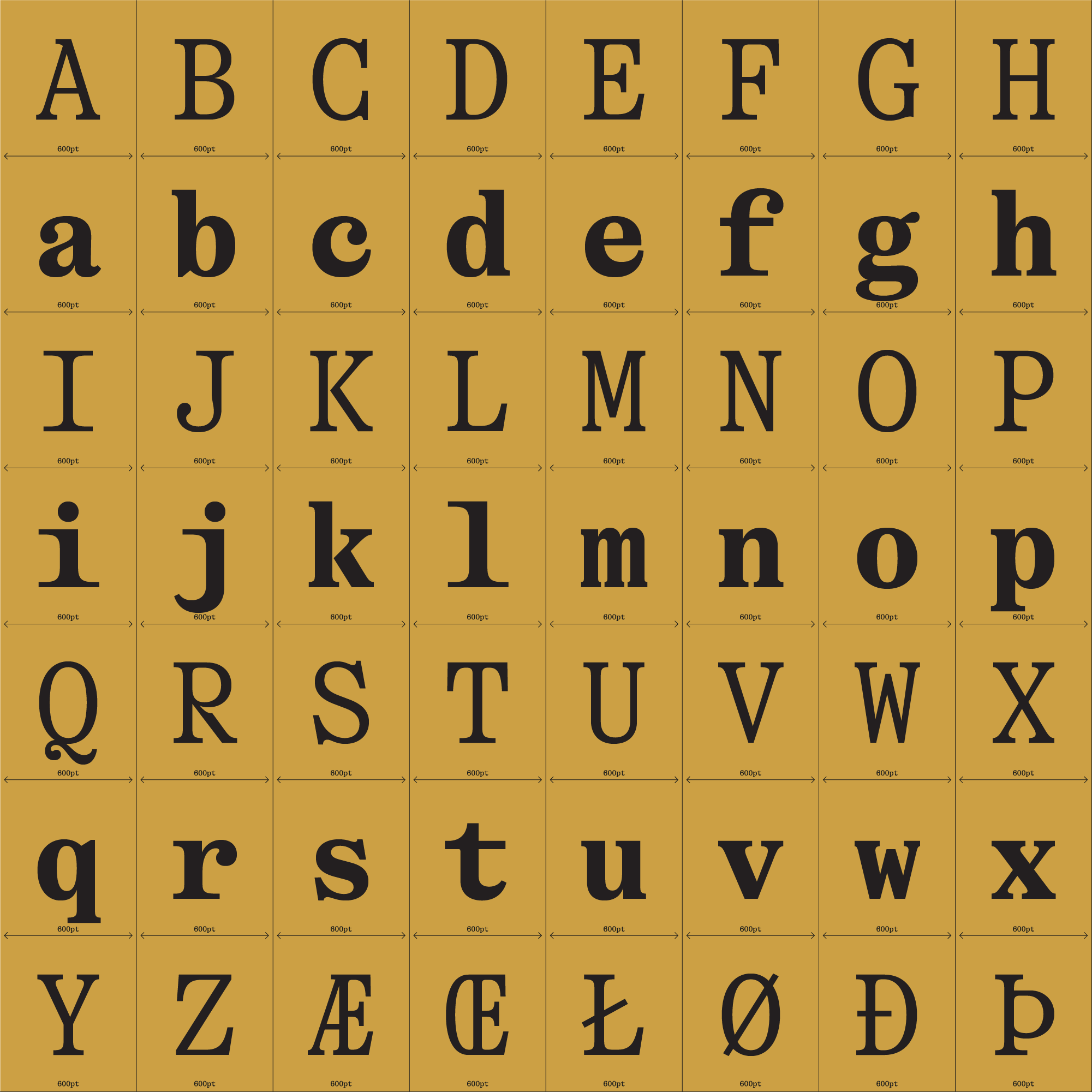
Oceanic draws inspiration from the upright contrast found in 18th and 19th-century fat faces like Bodoni, Canon, or Scotch Romans. It incorporates unconventional and whimsical details, such as the ‘c’ or ‘e’ resembling prehistoric oceanic creatures, while capital ‘R’ and ‘K’ are intentionally designed to stand out, evoking a sense of slight discomfort.
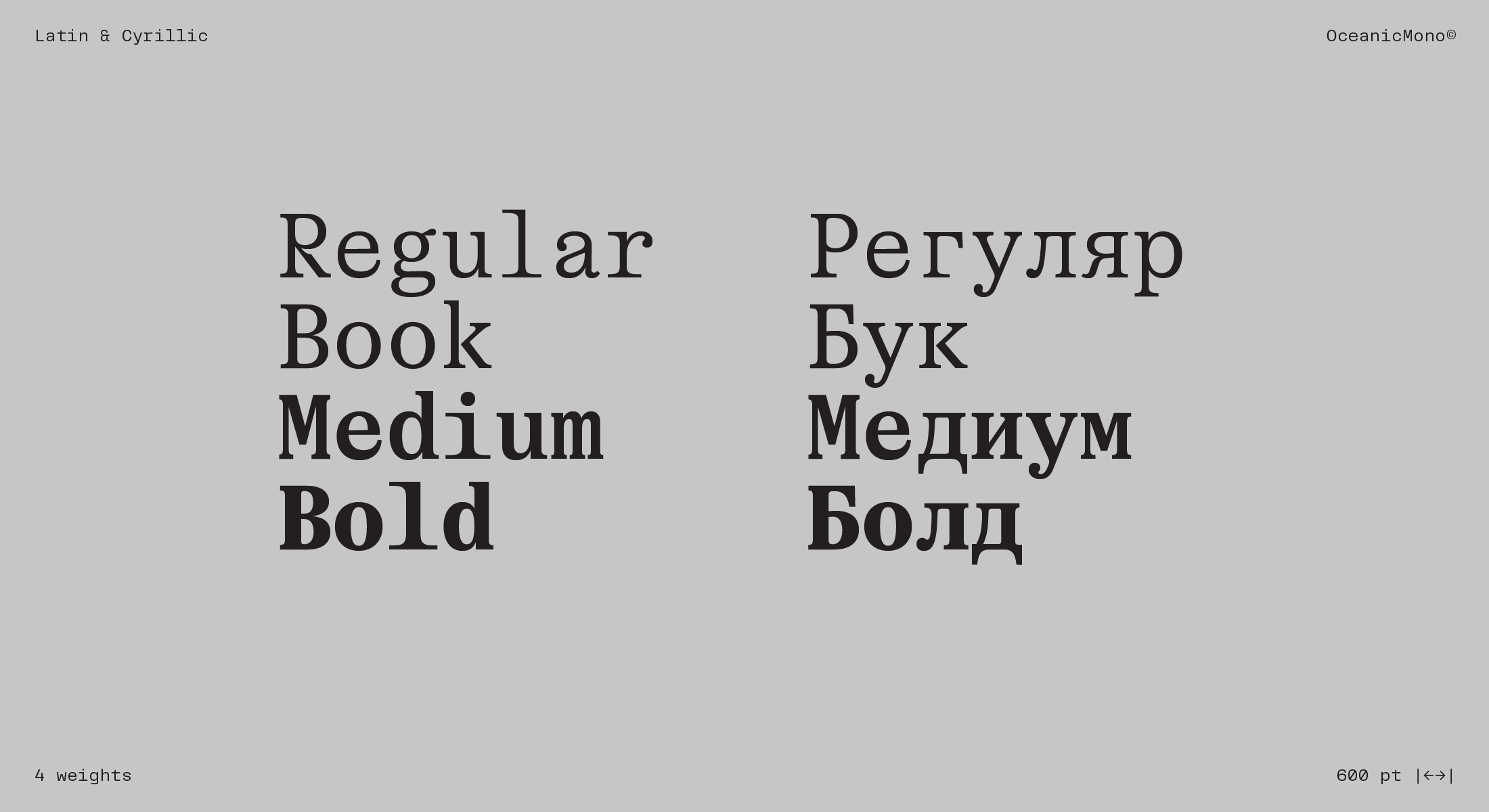
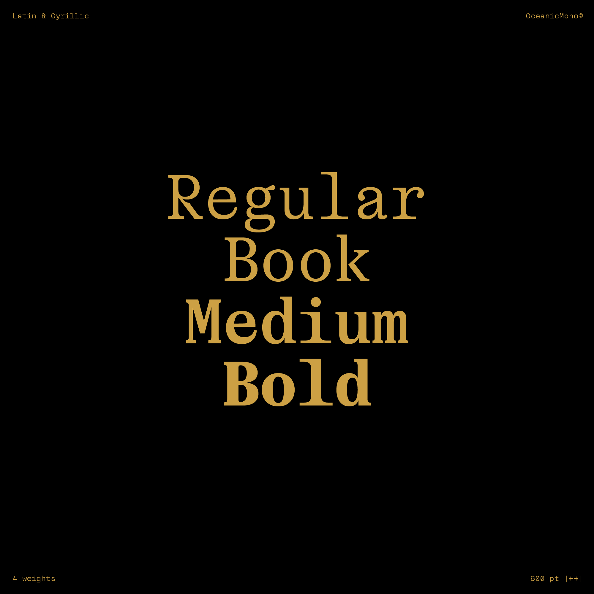
While the Display variant showcases these unique quirks, the Text family maintains sobriety, featuring reduced contrast and a slightly condensed form. Tailored for small sizes and continuous text, Oceanic embodies neutrality, elegance, and personality without overpowering or becoming mundane too quickly. It seamlessly infuses design projects with character and sophistication, striking a balance between attention-grabbing elements and enduring appeal.
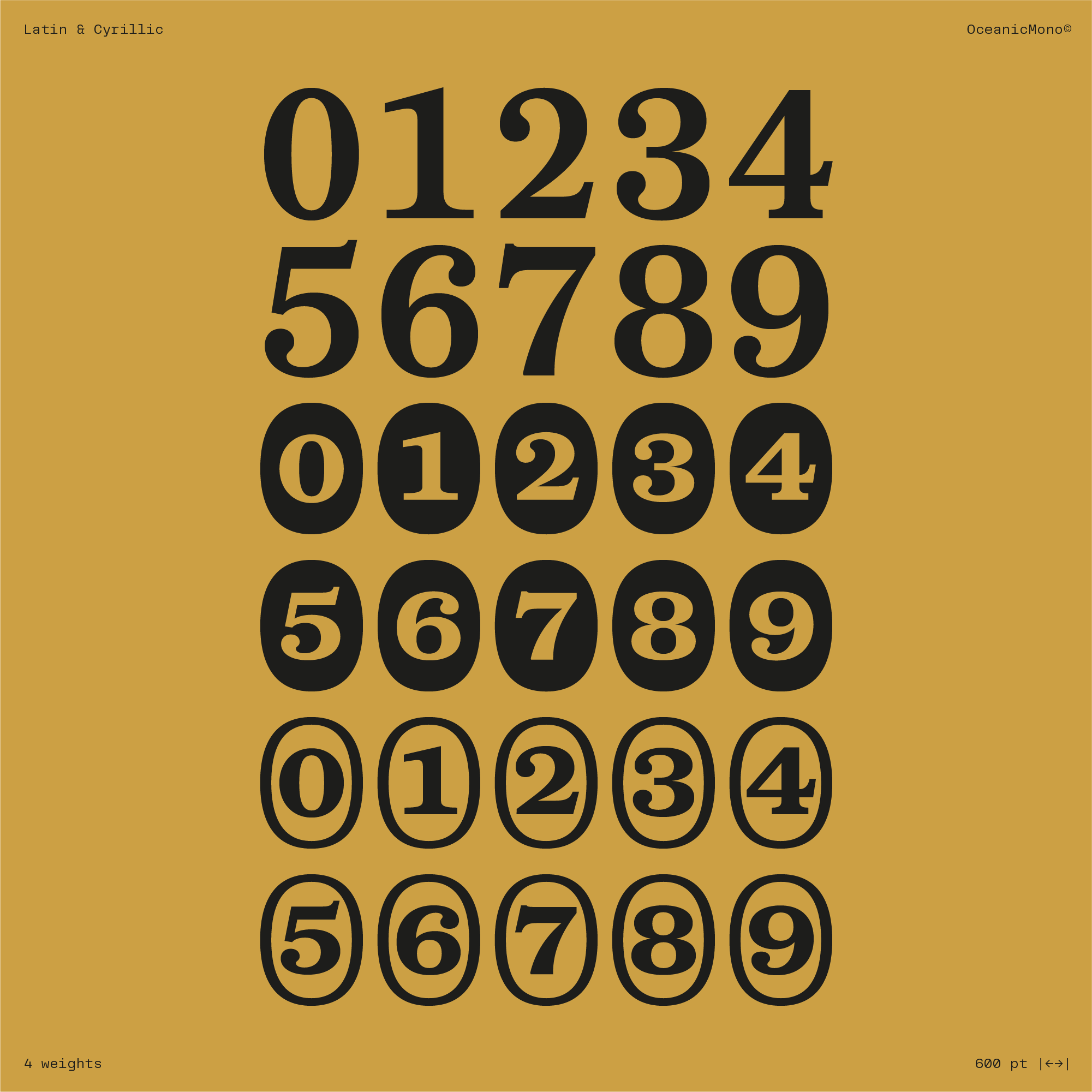
Oceanic Mono preserves the idiosyncratic details and charm of the Display and Text families while adhering to a fixed-width structure. Ideal for coding, tabular data, and technical documents, the Monospaced version offers a blend of readability and unique design. It combines the historical influences and modern aesthetics of Oceanic with the practical functionality required for precise alignment and consistent character spacing.
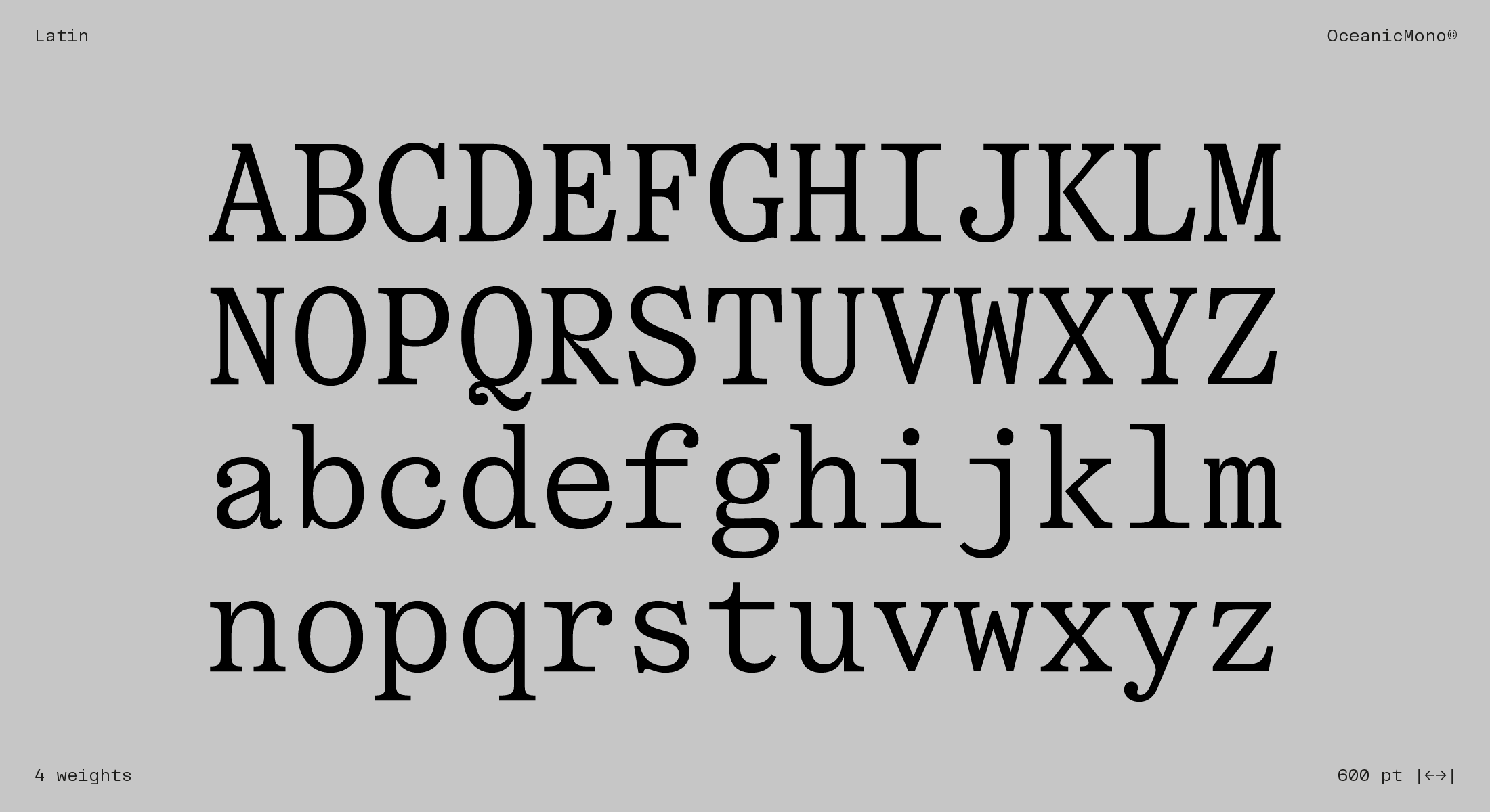
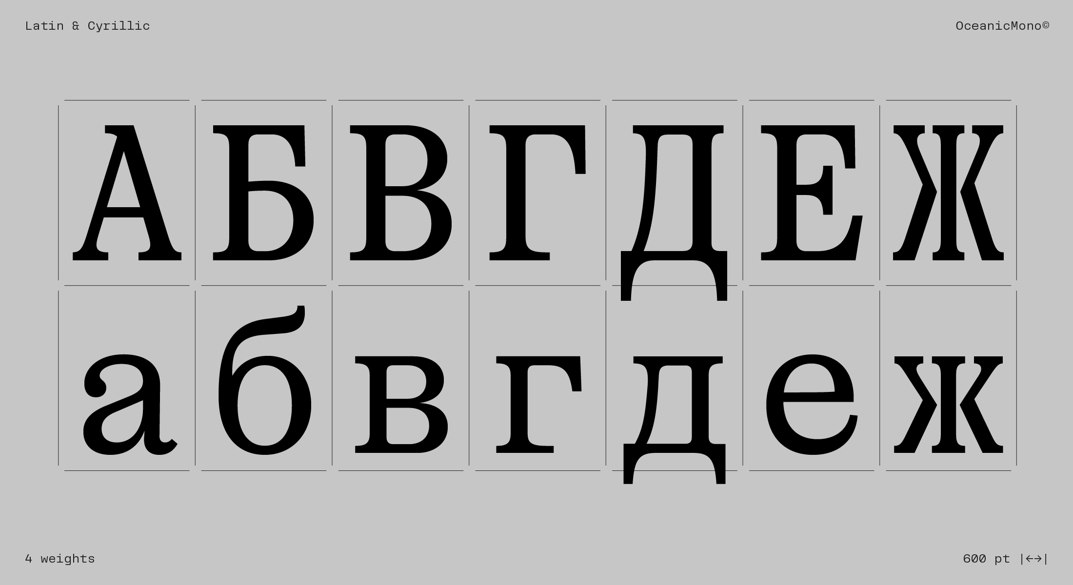
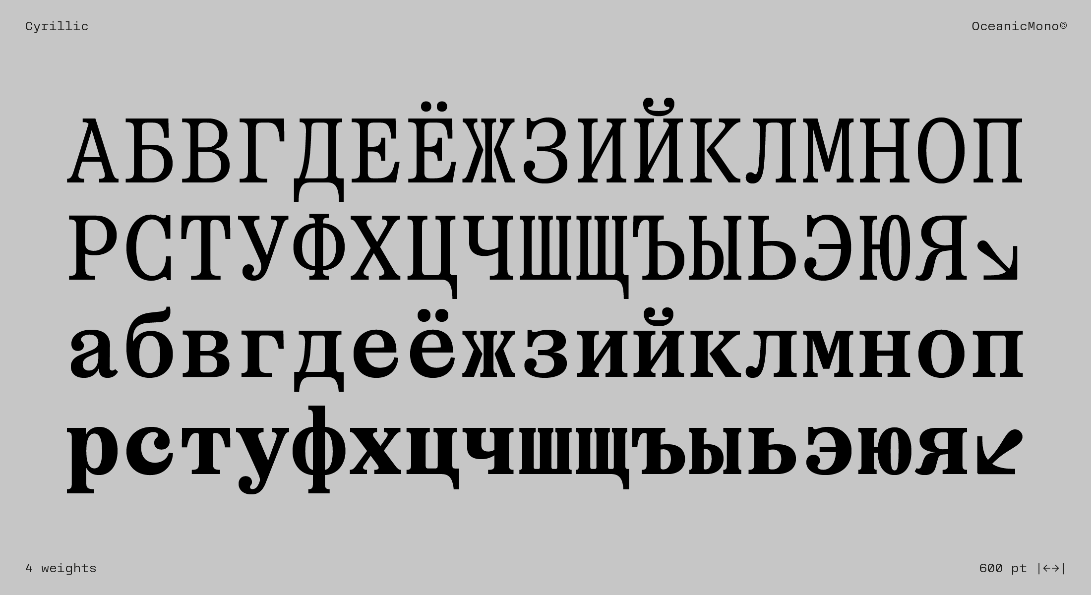
Scripts: Extended Latin, Cyrillic