- Copyright ©2019
- All Rights Reserved.
Download PDF Specimen
Riegraf, a quick story
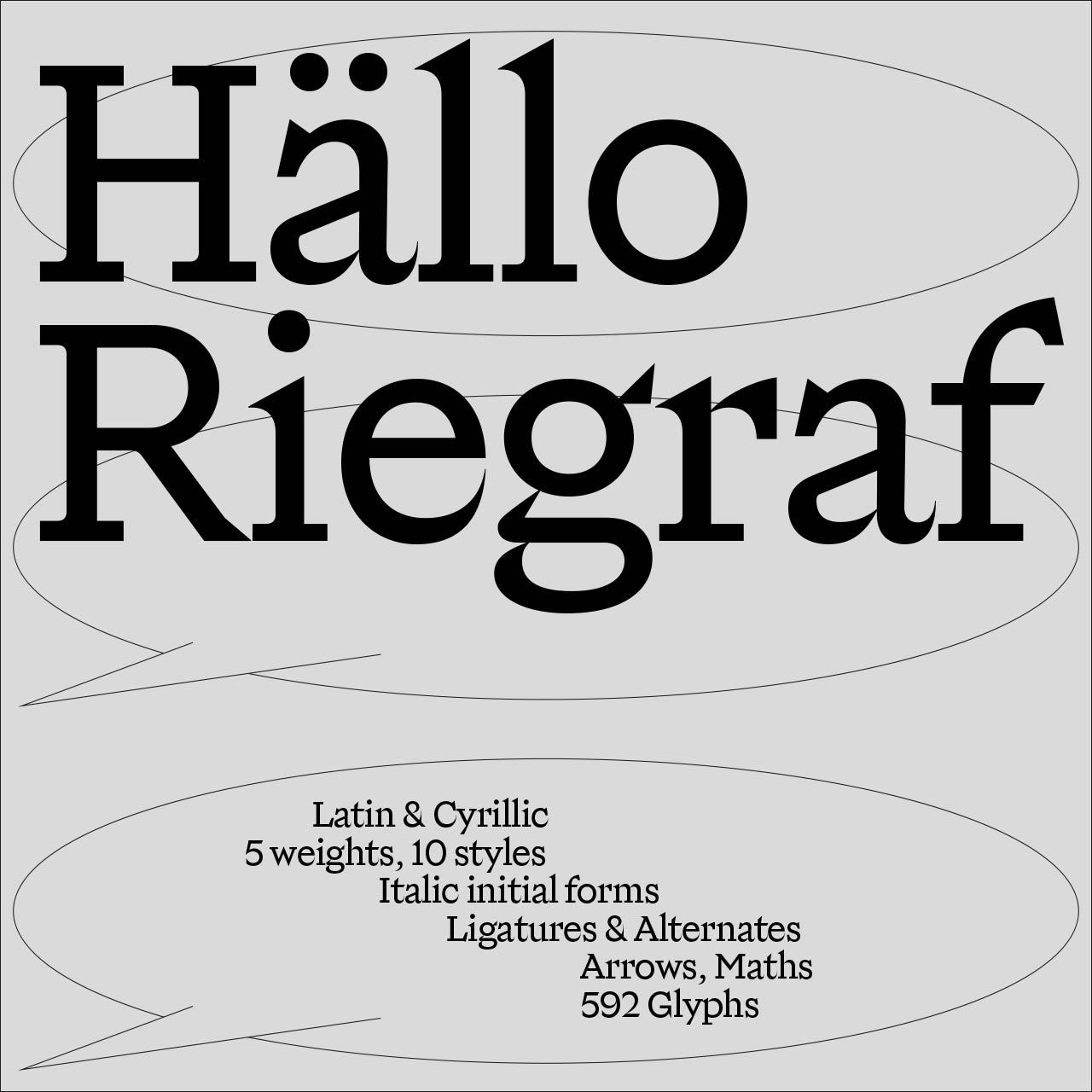
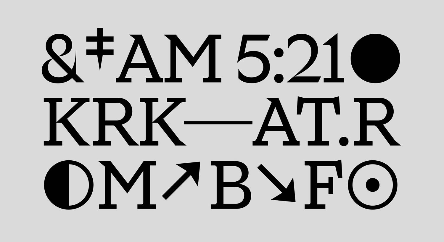
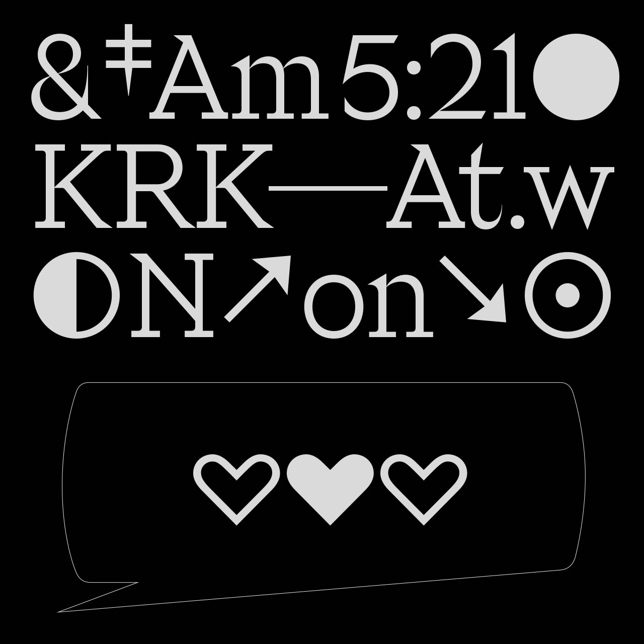
Riegraf was born out of an idea of designing a Serif typeface that feels like a geometric Sans-serif grotesk, while preserving the elegance usually associated with Serif typefaces.
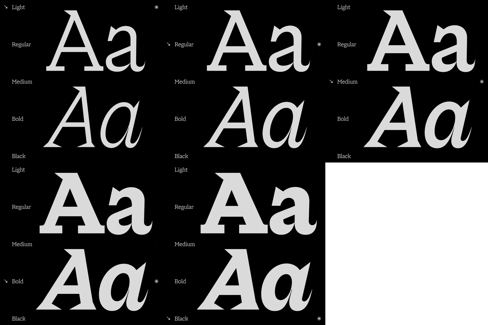
The result is a fusion Serif typeface that has simple square slab serifs, high contrast letters, that bring elegance, as well as low contrast letters and numerals/currencies, that might look like they belong to a Sans-serif typeface. This mixed design approach aims to create something truly unique and innovative. In short Riegraf could be described as a Geometric Fusion Serif.
Riegraf was designed as a “friend” companion to Riegla, a non-neutral grotesk font family also available on intervaltype.com. These two families share many commonalities and will work well together creating a page that truly stands out typographically.
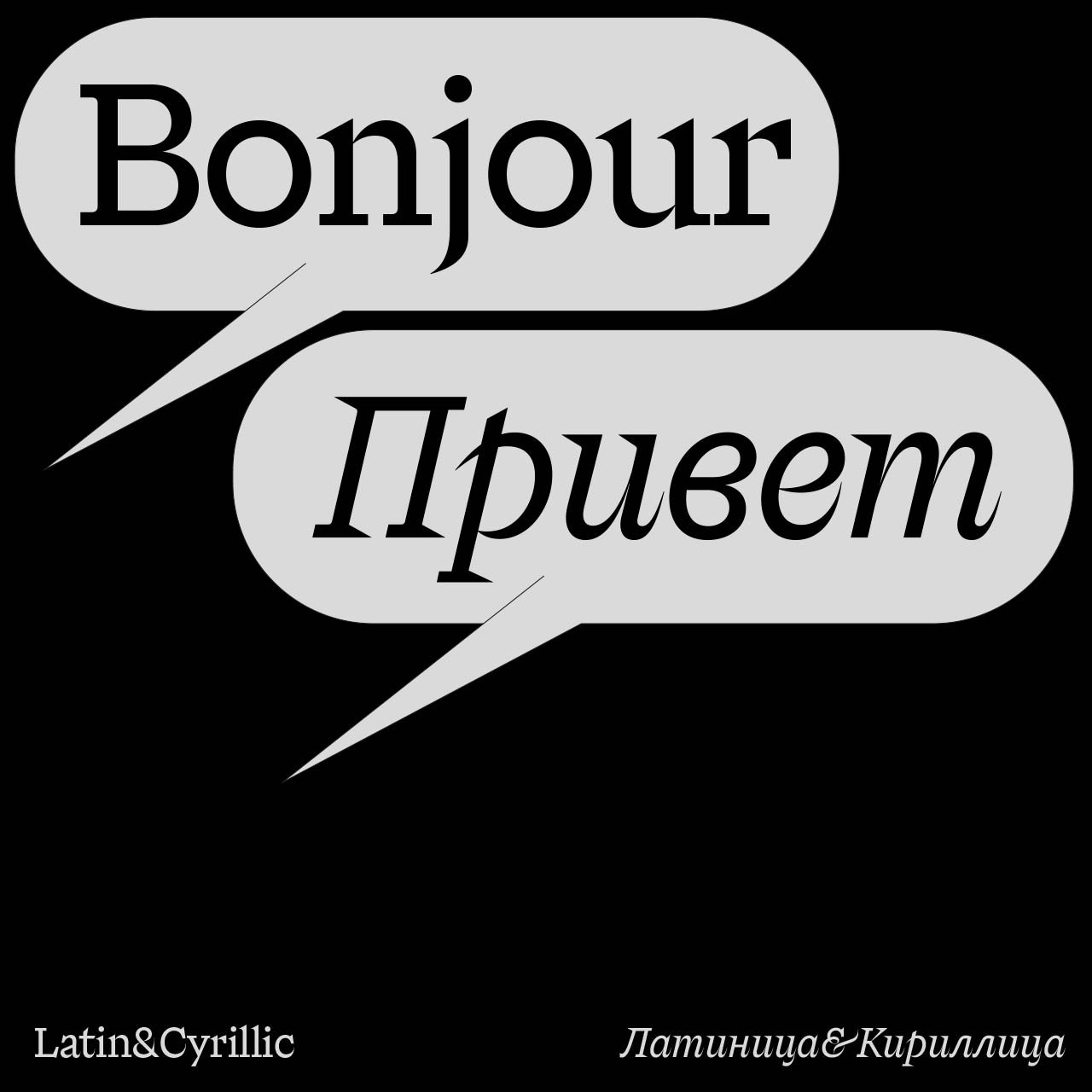
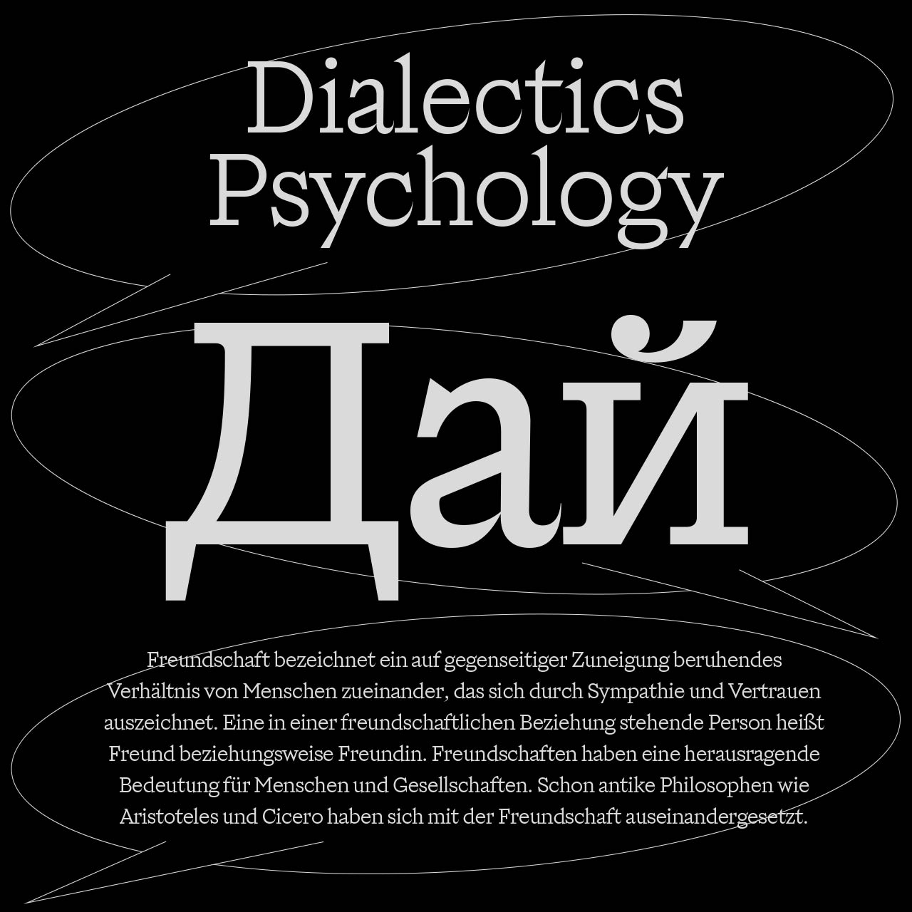
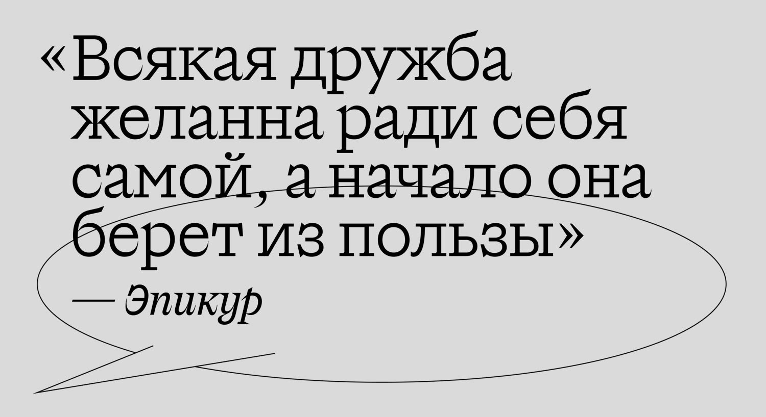
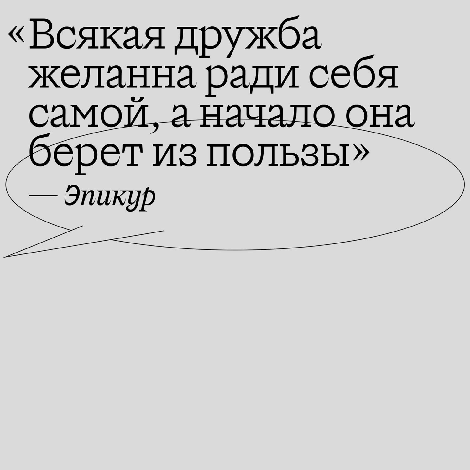
Scripts: Extended Latin, Cyrillic
Typeface minisite:


