
- Copyright ©2019
- All Rights Reserved.


Download PDF Specimen
Oceanic Gothic, a quick story
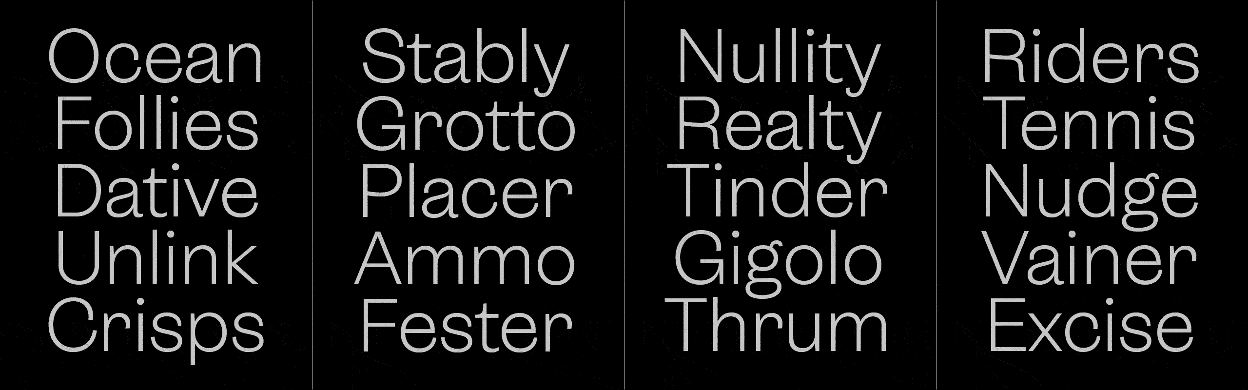
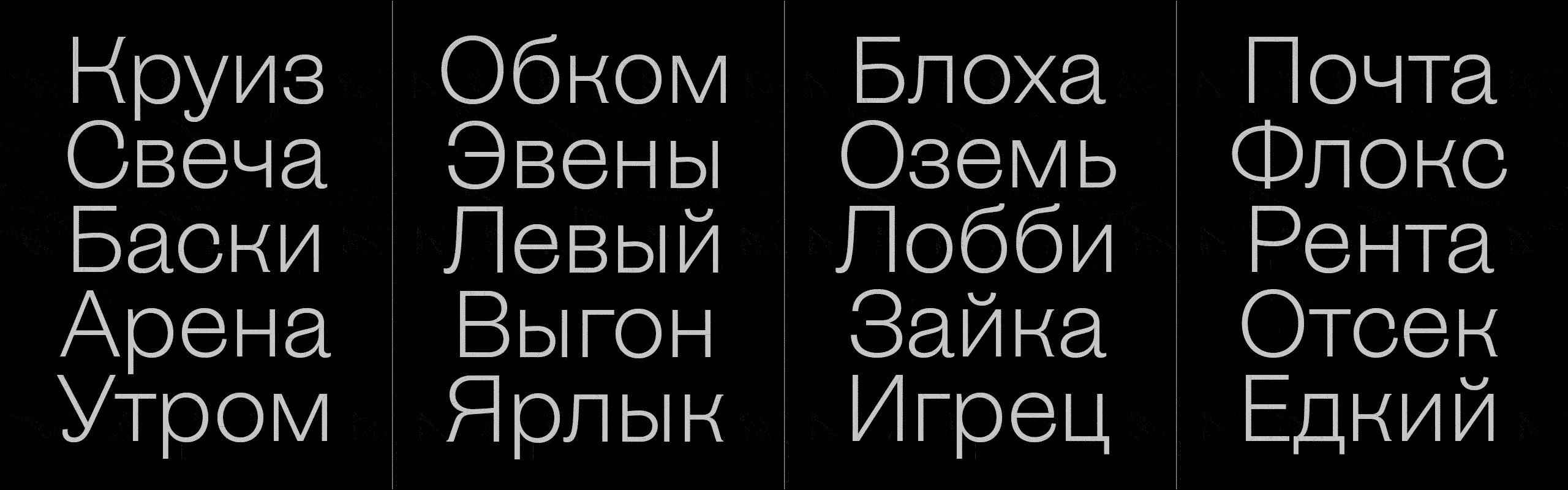
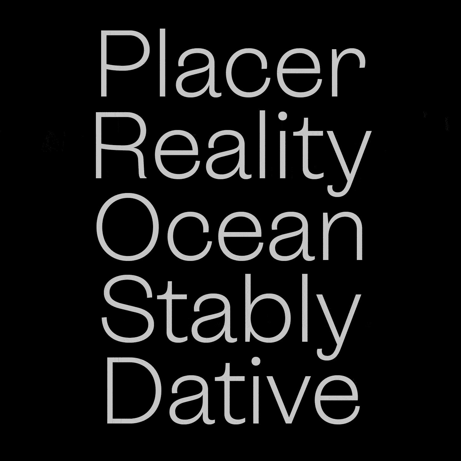
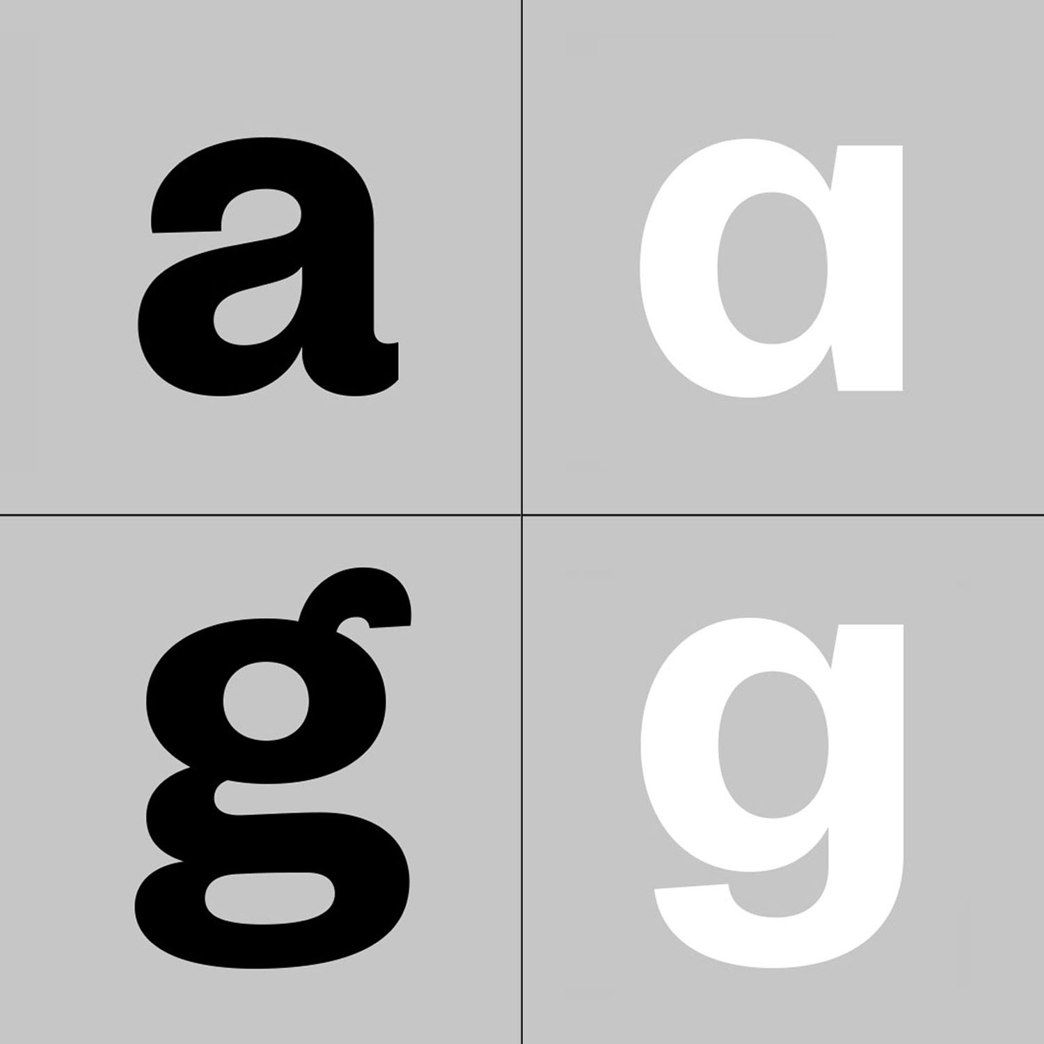
Oceanic Gothic was conceived as a sans-serif counterpart to the Oceanic and Oceanic Text serif font families, aiming to echo the distinctive design elements of individual letters found in Oceanic Display, creating unified typographic personalities. The outcome is a legible sans serif typeface infused with an engaging and lively character.
While Oceanic serif draws inspiration from 18th and 19th-century fat faces like Bodoni, Canon, or Scotch Romans, Oceanic Gothic explores the realm of the first sans-serif typefaces from the late 19th to the early 20th centuries. Defined by its charismatic essence, Oceanic Gothic exudes a display-type personality while seamlessly adapting for text settings.
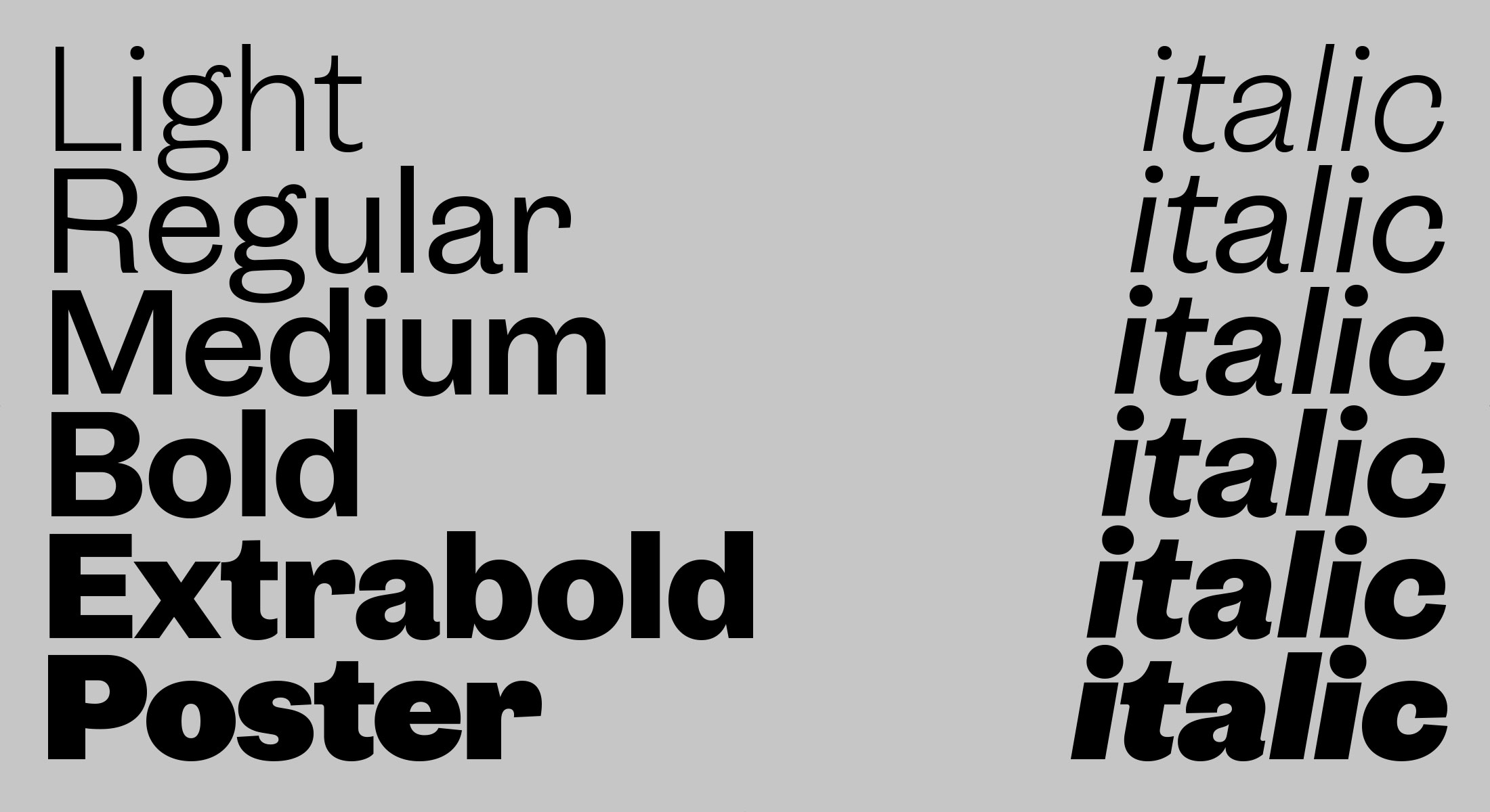
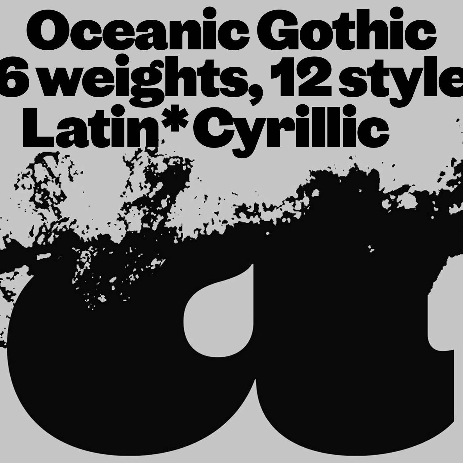
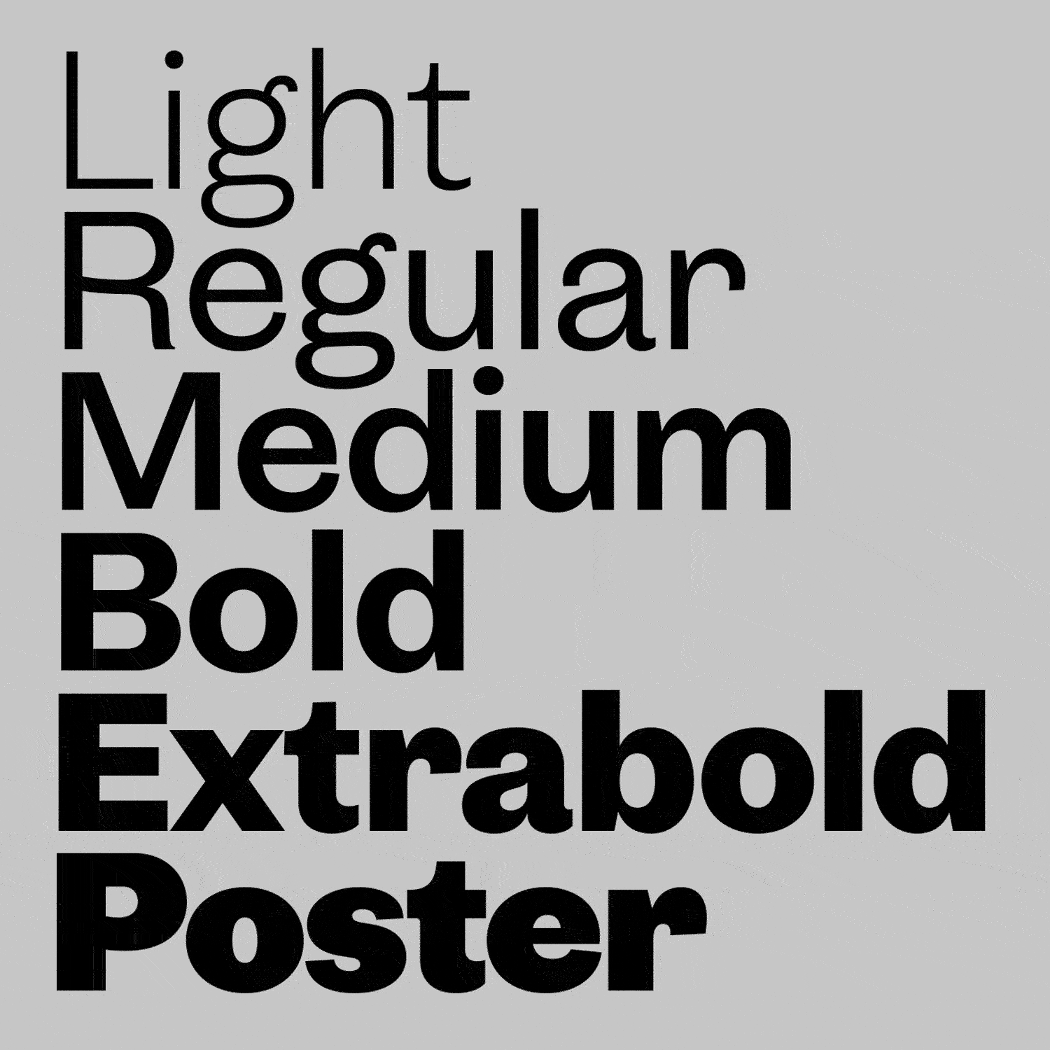
Offering 6 weights and 12 styles ranging from Light to Poster, accompanied by corresponding italics, Oceanic Gothic also boasts compatibility as a variable font.
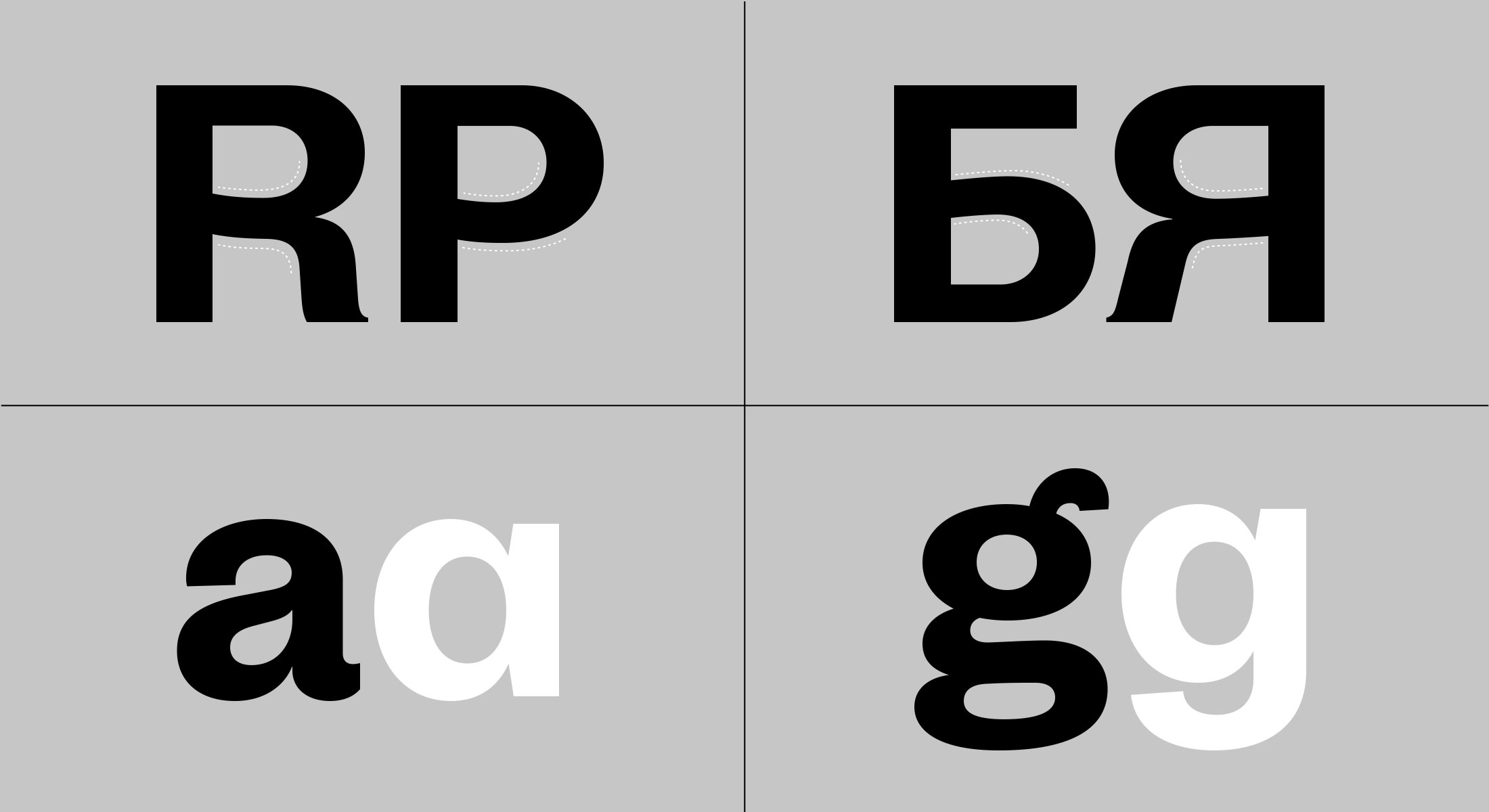
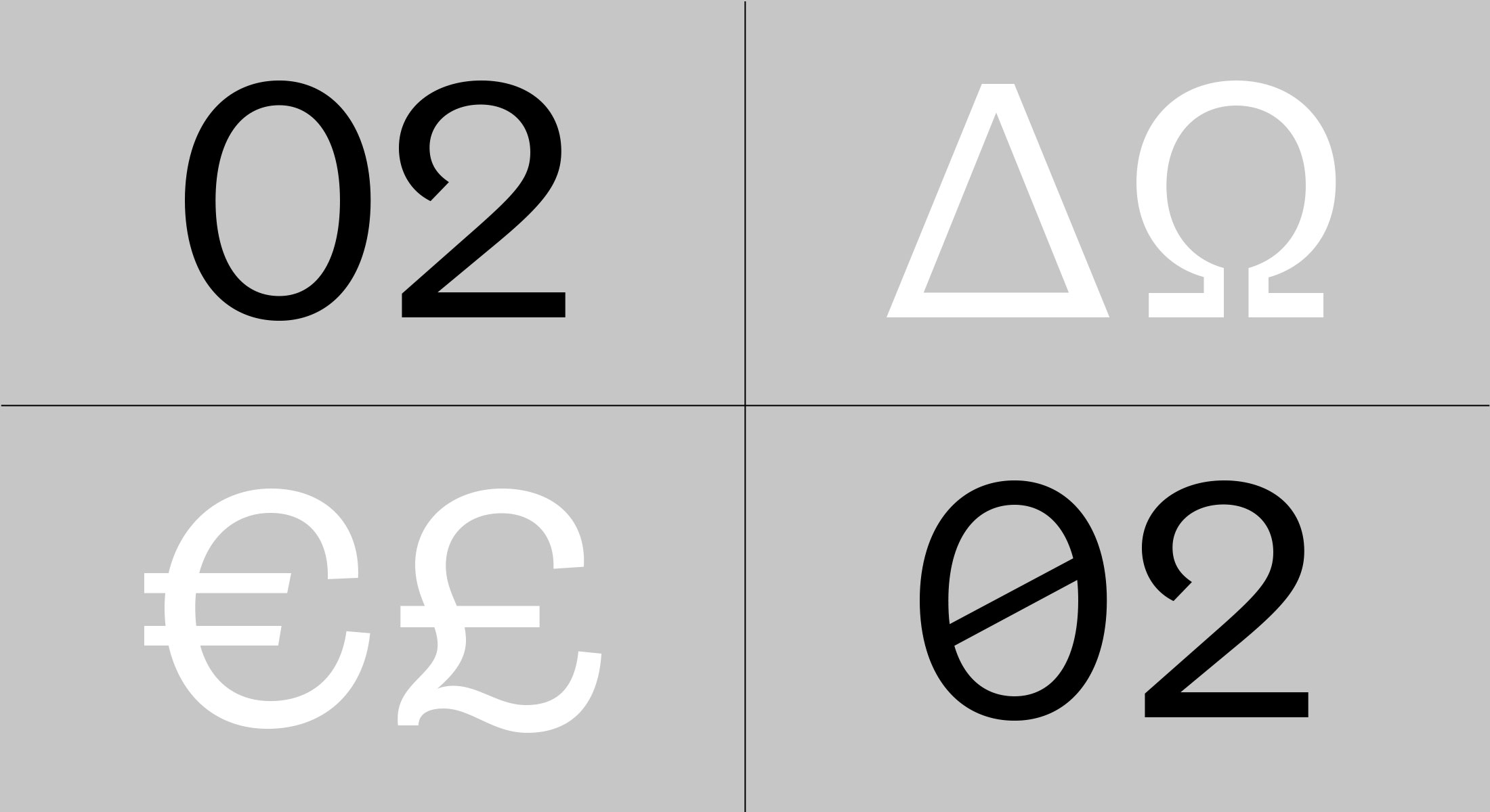
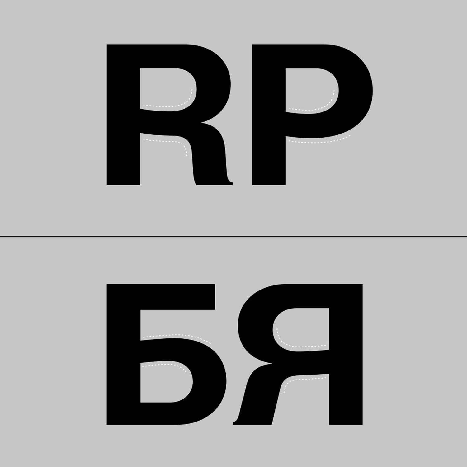
Scripts: Extended Latin, Cyrillic